5 Types of Watercolor Charts - Type 3: Color Wheel
If you’re just joining in on the series you can find blog posts on watercolor charts type 1 here and type 2 here.
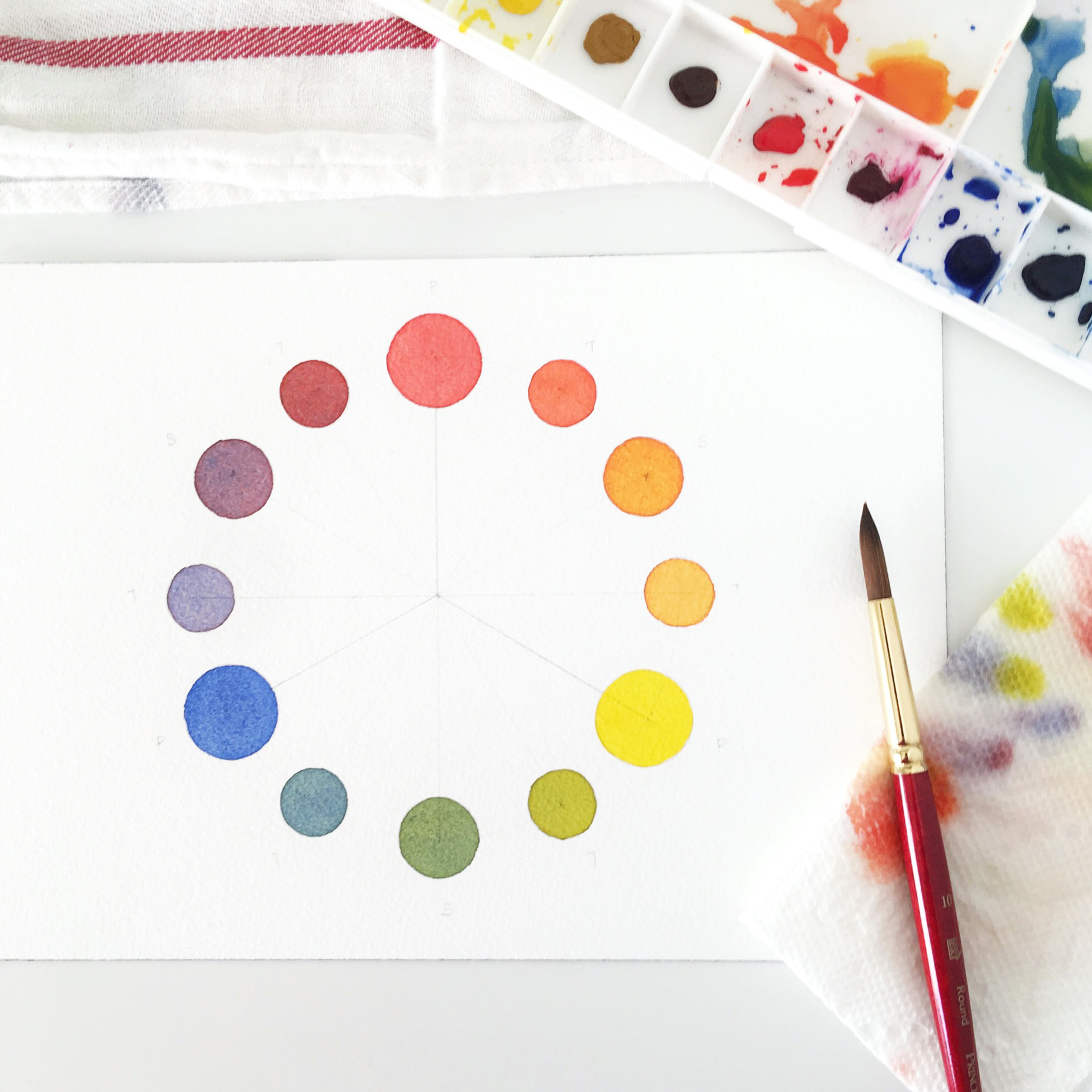
We’re in week 3 of this series, and today is probably one of my favorite (and easily the most photogenic) color chart of the series: the color wheel.
The color wheel is a great starting point to enter into color mixing and color theory - and where I think I first discovered how magical painting was when I was young. There’s nothing like taking two paints and seeing them mix to create a brand new color right before your eyes. It really felt like magic when I was a kid. In fact, to be honest, I think I’m still awed by all the different colors I can make with just a few colors even now...
The Color Wheel
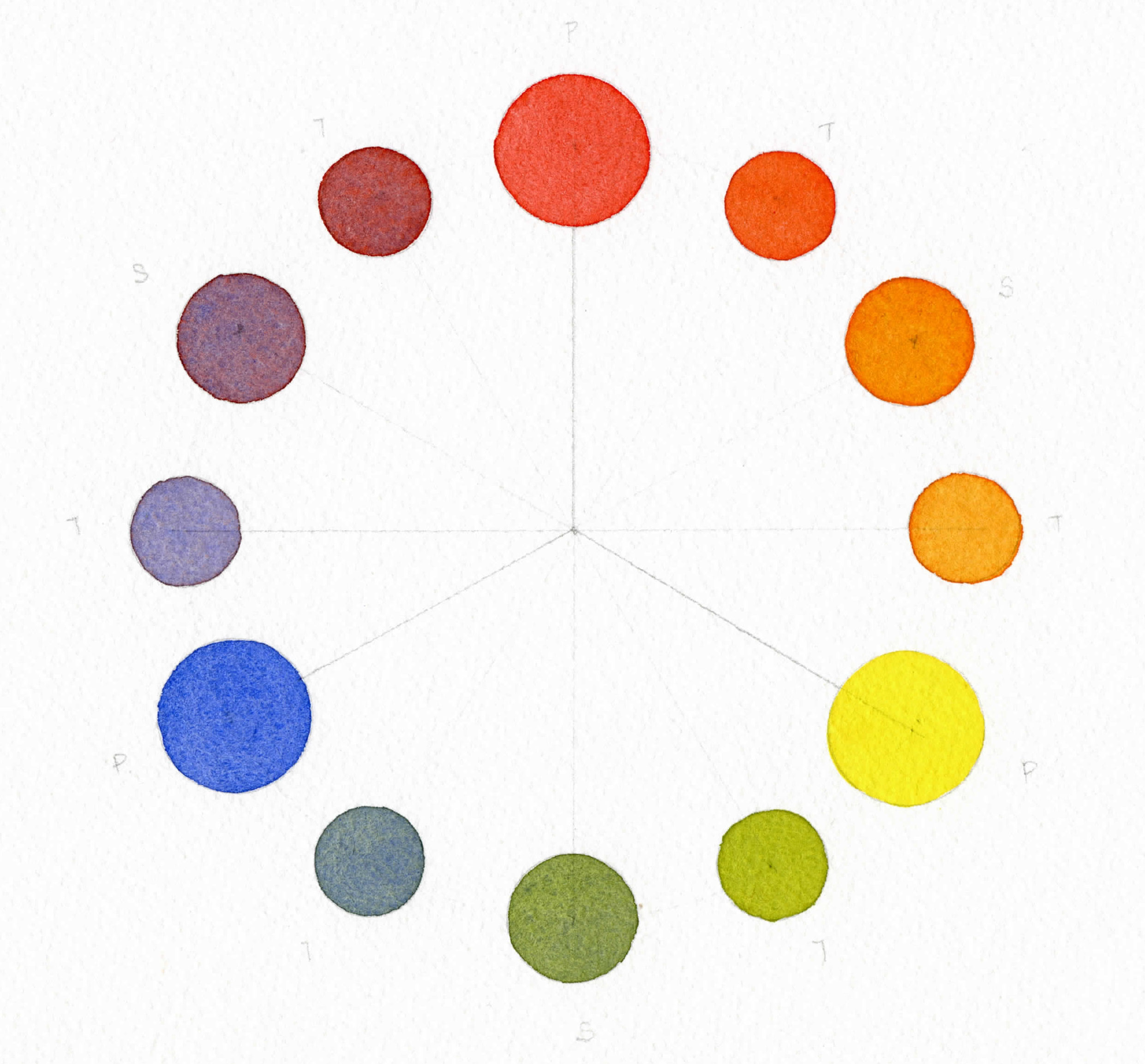
The color wheel is based on three primary colors. These three primary colors are mixed to create three secondary colors and then three tertiary colors.
PRIMARY COLORS
The primary colors that make up a color chart are: red, yellow, and blue. These colors cannot be made by mixing together any other colors. But theoretically, all colors can be made from these three colors - including black (just mix them in equal parts). This also means that you could (theoretically) paint using only these three colors without buying any other paints.
But there are so many reds, yellows and blues in watercolors, which ones do you choose? In this blog post, I’ll show 3 different color wheels using different reds, yellows and blues.
However for now and for simplicity’s sake, based on what I've seen, the “traditional primaries” are considered to be:
cadmium red
cadmium yellow
ultramarine
So if you’re just starting, these three would be good primary pigments to pick up.
SECONDARY COLORS
The secondary colors - orange, green, and purple , are created by mixing two primaries:
Red + Yellow = Orange
Yellow + Blue = Green
Blue + Red = Purple
With these 6 colors, you now have all the colors of the rainbow.
TERTIARY COLORS
The tertiary colors are in-between colors created when mixing a primary with a secondary. For example: blue + green or red + purple. Tertiaries are known to produce hues that are more “dull” than primaries or secondaries.
Now, let’s get started painting a color wheel and then take a look at a few different color wheel examples.
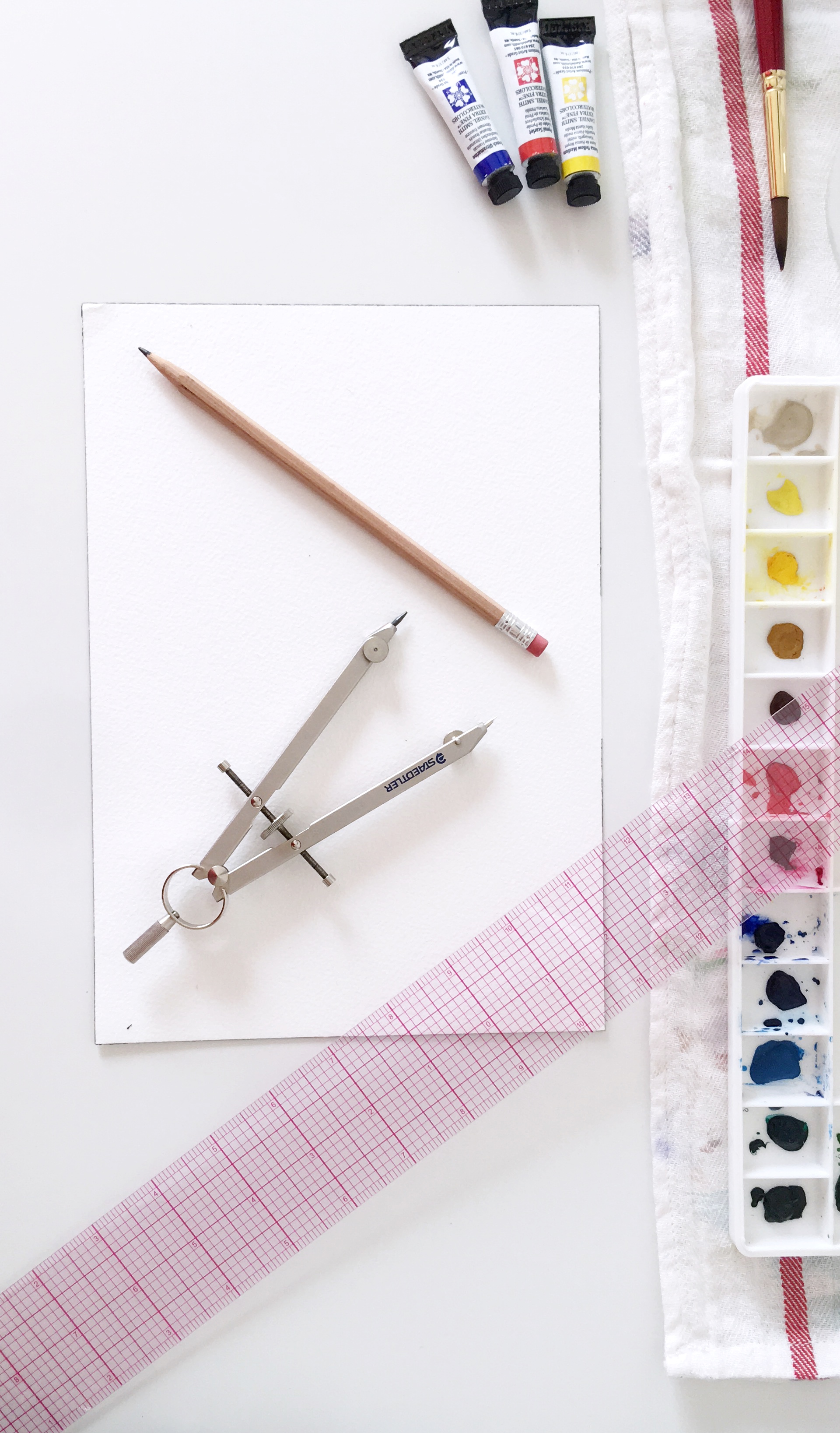
Supplies Needed:
Besides the obvious paints, paper and a brush, you'll need a few other materials to make your charts. I'll list all of them below with a few recommendations:
watercolor paints
watercolor paper (140lb/300 gsm)
watercolor brush (size 6 or 8)
ruler (I use a protractor ruler)
pencil (2B)
compass (or a circle shape you can trace, like a CD)
circle template (optional, similar)
water
paper towels
Just a note: Links to the tools I use are affiliate links. I purchase my own tools from these sites unless stated as 'similar'. If you click through and purchase, I earn a small commission with no extra cost to you.
How to paint a color wheel
Draw your your wheel (Optional)
I prefer drawing out my wheel before painting, but you can definitely free-hand it, if you want to dive right in! Read on to see how I draw mine.
Using a compass with the radius set to approx. 2 1/2”, I draw a light circle on the page, making sure to mark the center point with a pencil. If you don’t have a compass, you can use a CD - if you have any of those laying around- it’s a good size for this exercise!
Using a ruler, draw lines to divide the circle into 12 equal slices. I draw my lines in this order:
Draw a vertical line - cut the circle in half top to bottom
Draw a horizontal line - cut the circle in half left to right
Lightly mark off two ticks spaced evenly along the circle between each of the quarters
Check it: If you’ve done this right, you should be able to see that there are 12 ‘spots’ along the circumference of the circle.
Note: If you want to use a protractor, the circle should be divided into twelve 30º wedges. When I want to be very exact, I do this - and I find that this protractor ruler is really useful!
At each of the 12 points, you will be drawing circles with the center-point of the circles falling along the circumference of the large circle. You can free-hand or use a circle template to draw these circles.
Note: You can make them all the same size or you can make them different sizes to help differentiate between primary, secondary and tertiary colors. I prefer varying the sizes.If you are varying the sizes, I like to draw the circles as follows (using clock face designations):
Primary colors (largest circles) at 12:00, 4:00, 8:00
Secondary colors (medium circles) at 2:00, 6:00, 10:00
Tertiary colors (smallest circles) at the remaining 6 locations
Paint your Wheel
Now for the really fun part - painting and mixing colors!
This is the order in which I like to fill out my chart, although you may prefer to do it differently!
Paint all 3 primaries into their designated circles. I always start with Red at the top and work around clockwise to Yellow and then Blue. (Remember to clean your brush thoroughly when switching colors.)
In the same clockwise direction, mix your secondary colors. Using equal parts red + yellow, make orange and paint it into the secondary color position located between red and yellow on the wheel. I continue by finishing all the secondary colors. Note: During this step, I try to make sure to have enough paint mixed on my palette to have a “leftover puddle” to use when I get to step 3. If you want to be _really_ prepared, make sure you have two separate puddles leftover for each secondary color - you’ll see why.
Working in a clockwise direction again, I mix the tertiary colors by picking up red and mixing it into the leftover puddle of orange to create the intermediate red-orange color. Next, I take yellow and mix it into orange to create the intermediate orange-yellow color. This is where having 2 puddles left over is useful - because you need to have each secondary color on hand twice to create the tertiaries! Finish by continuing around the circle until you’re done!
Color Wheel Primary Color Variations
Below you’ll see examples of two different color wheels using two sets of primary colors: warm and cool.
Warm Primaries
A selection of primary colors that are warm-toned, meaning they have red/yellow undertones.
Pyrrol Scarlet
Hansa Yellow Medium
French Ultramarine
(all Daniel Smith Watercolors)
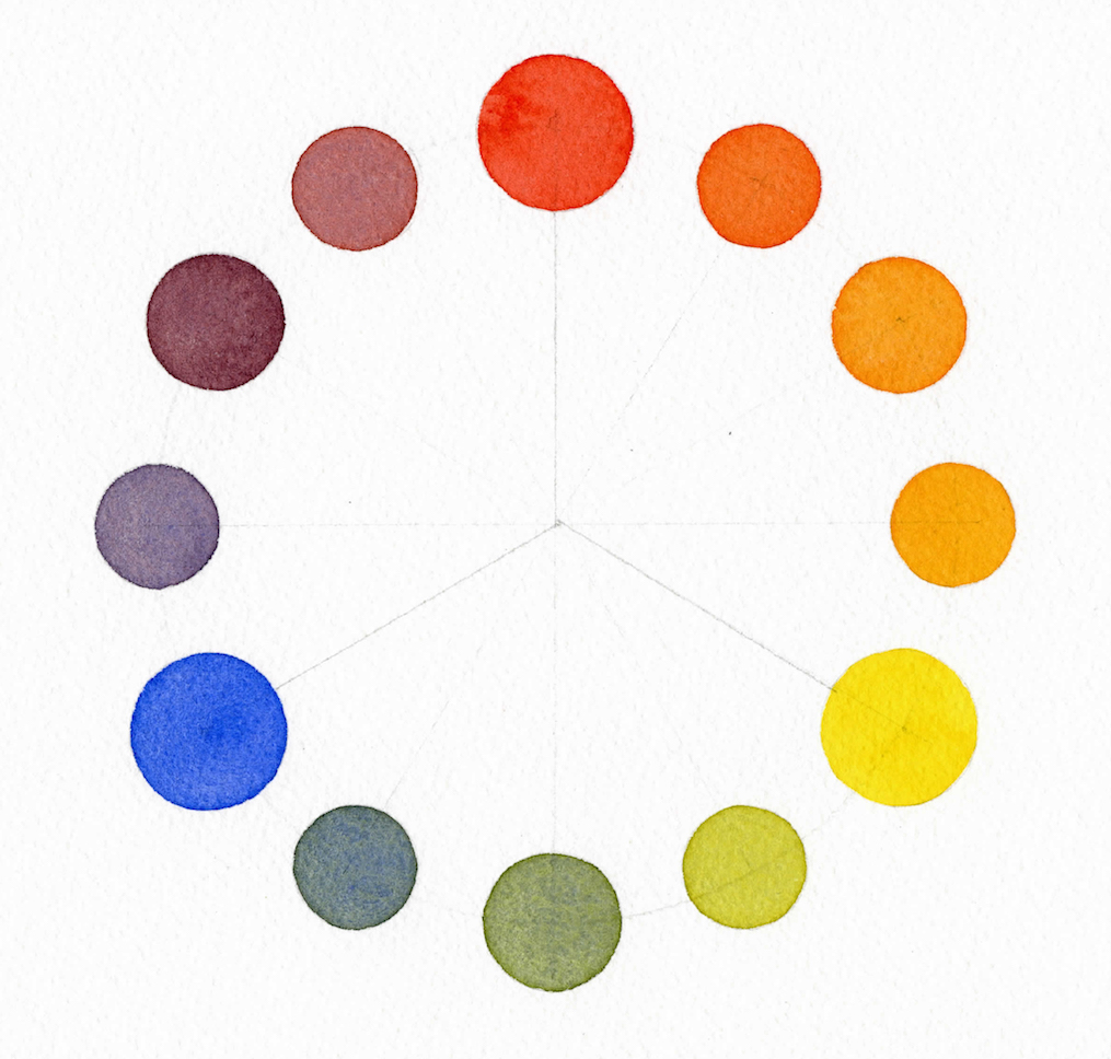
Cool Primaries
A selection of primary colors that are cool-toned, meaning they have more blue/green undertones.
Quinacridone (Quin) Rose (yes, pinks can be used as reds!)
Hansa Yellow Light
Cerulean Blue Chromium
(all Daniel Smith Watercolors)
It’s really interesting how changing primaries creates such a different range of colors, isn’t it?
Student Grade Paint Test
I like recommending artist grade paints if it’s within budget, but I did a test with my student grade tube paints (what I started painting with) and I still got a beautiful color wheel out of it. Just note that when painting with student grade paints you’ll need to "work" them more (add more water and take note to load your brush with more pigment). Because student grade paints have more binder than pigment, you’ll need to use more paint to get the same color payoff, but it can be done!
Color Wheel using all Winsor & Newton Cotman (student grade) Watercolors
Cadmium Red Hue
Cadmium Yellow Hue
Ultramarine
I hope you give this a try and maybe even experiment with variations of primaries if you happen to have them in your paint collection.
FREE BONUS: WARM + COOL COLOR WHEELS
I thought that having these color wheels might be useful as a reference (especially if you don’t have these colors just yet and are considering investing in them)! Click the link below and enter your email to get the free PDF:
If you're looking for a challenge, you might want to check out this color wheel by Jane Blundell that combines warm AND cool primaries into one wheel! It looks fun and I have it on my list of things to try out!
Next week I’ll post watercolor chart type 4. If you’ve been following along and found this helpful, let me know by liking this post or commenting below with any questions or suggestions for other things you’d like to see in the future!
Thanks for reading,
Susan
