
My Top 6 Essential Colors For Every Watercolor Palette
It doesn’t matter if you’re just starting or you’ve been painting for a while, it’s natural to look at what colors other people are using and wonder if you should add them to your collection too.
It’s a great thing to do and I highly encourage doing the research. Because I did not.
When I first started painting, I researched what other people were using in their palettes. I had some decade-old watercolors I was using and decided they weren’t cutting it and I went straight to the store.
I went to my local Michaels store (a generic big-box arts and crafts store if you don’t know what it is) and found the watercolor section. The selection is pretty limited but I didn’t know that at the time.
The watercolors at Michaels are all locked up in a plastic case so I ran the bell so a store employee could unlock it. Except when she finally opened the case I stood there apologizing because I didn’t know what I was buying. See? Should have researched.
I honestly don’t even remember what color or colors I bought that first trip. But ended up making several trips to my local Michaels - each time buying a new color with the weekly coupon but not actually knowing why I was buying that color.
At some point I thought it was a good idea to buy Winsor & Newton Cotman Hooker’s Green Dark AND Light. They almost look the same and if I’m honest I found out that I didn’t love that shade of green.
I was so indecisive and uninformed. And I definitely bought a bunch of colors I didn’t need or even like in the end. Why I didn’t use the power of the internet is beyond me.
Maybe as you’re reading this, you have no idea why you would want to see what other people are using and build a small palette instead of buying all the colors. If you want to buy all the colors because you can afford it and enjoy it, please go ahead! I’m not here to forbid anyone from the joy of owning beautiful paints.
But, if you’re wanting to start more conservatively, then my advice would be to use the internet to your advantage. You don’t need a ton of colors but you need a good foundational set of colors to start with. You’ll find a lot of artists share their basic palettes - most of them are 12 colors - and everyone is a little different. The one commonality you’ll likely notice is that these palettes all include a base set of primaries. Then artists will add earth colors, neutrals, or even other favorites they use a lot.
The colors in your palette are a personal choice. Sometimes you need to paint with the colors in order to make decisions on whether or not you like them enough to keep them in your palette.
Either way, it’s helpful to see what other people use before you buy. Today I’m sharing the 6 of the essential colors I include in all my palettes along with some notes about changes I might make in the future!
My Top 6 Essential Colors
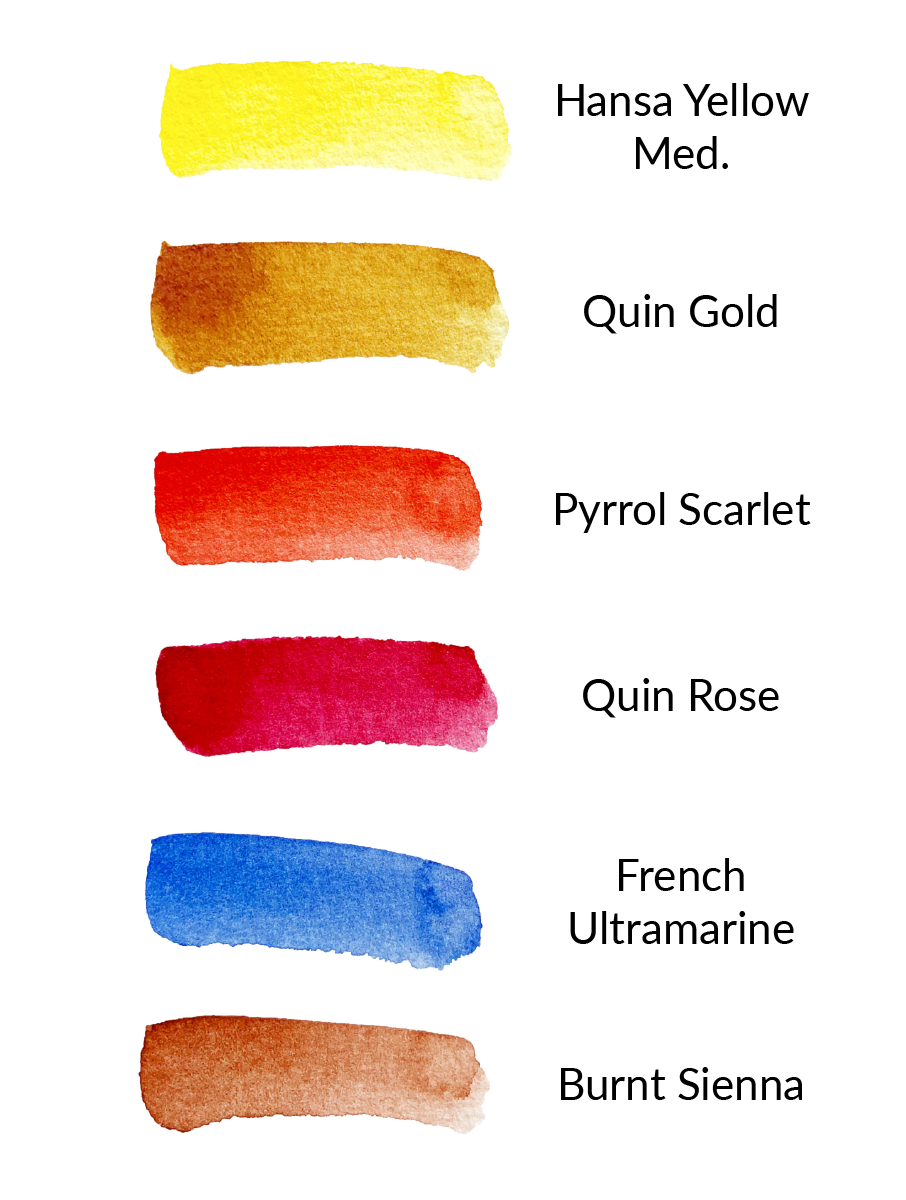
Below are 6 colors that I find are essential in a palette. You don’t have to have these exact paint colors. I’ve included the general color name so that you can shop around for a paint in that color family instead.
Primary Yellow: Hansa Yellow Medium (Daniel Smith)
Earth or Deep Yellow: Quinacridone Gold (Winsor & Newton Professional)
Red-Orange: Pyrrol Scarlet (Daniel Smith)
Magenta: Quinacridone Rose (Daniel Smith)
Blue or Blue-Violet: French Ultramarine (Daniel Smith)
Earth Red-Orange or Brown: Burnt Sienna (Daniel Smith)
A few notes on each color + Sample color mixes
I thought the best way to show some of the many color options you have with this palette is by sharing a examples. Below I have a new notes on each color along with a color mix sample so you can see for yourself what colors are possible even with a limited palette.

Hansa Yellow Medium
A staple for mixing up with blues to make greens/yellows for foliage. When mixed with French Ultramarine, it creates a variation of nice greens.

Quinacridone Gold
Quin Gold is an earthy yellow that I find myself using to make colors “earthier” or more muted.

Pyrrol Scarlet
I’ve had this warm red for as long as I can remember.

Quinacridone Rose
This color is a wonderful mixing color in general. It makes beautiful purples and violets when mixed with Ultramarine. I mixed it with Burnt Sienna to see what it would do and the result is a very pretty muted pink. It is a lovely pink on its own as well.

French Ultramarine
Ultramarine blue is a staple in almost every palette I’ve seen, including my own. I’ve used French Ultramarine for a long time.

Burnt Sienna
I use a lot of Payne’s grey but if you don’t have that in your palette, Burnt Sienna is popularly used to mix with Ultramarine to create greys. It is useful to have an earth brown as well in my palette. However, after researching, I plan to also add Transparent Red Oxide (as suggested by Liz Steel)
If you’re looking for more palette inspiration, check out the list of color palettes from various artists here on Parkablogs.
Please note that I am no longer selling my swatch stamp at the moment. Apologies for the inconvenience. The best way to keep in touch and find out if I decide to take orders again for Swatch Stamps is to click here and sign up for my newsletter.
6 Color Palette Demo
And to test out what it looks like if you were using these essential colors as a limited or minimal palette, I painted a sketch using just these 6 colors.
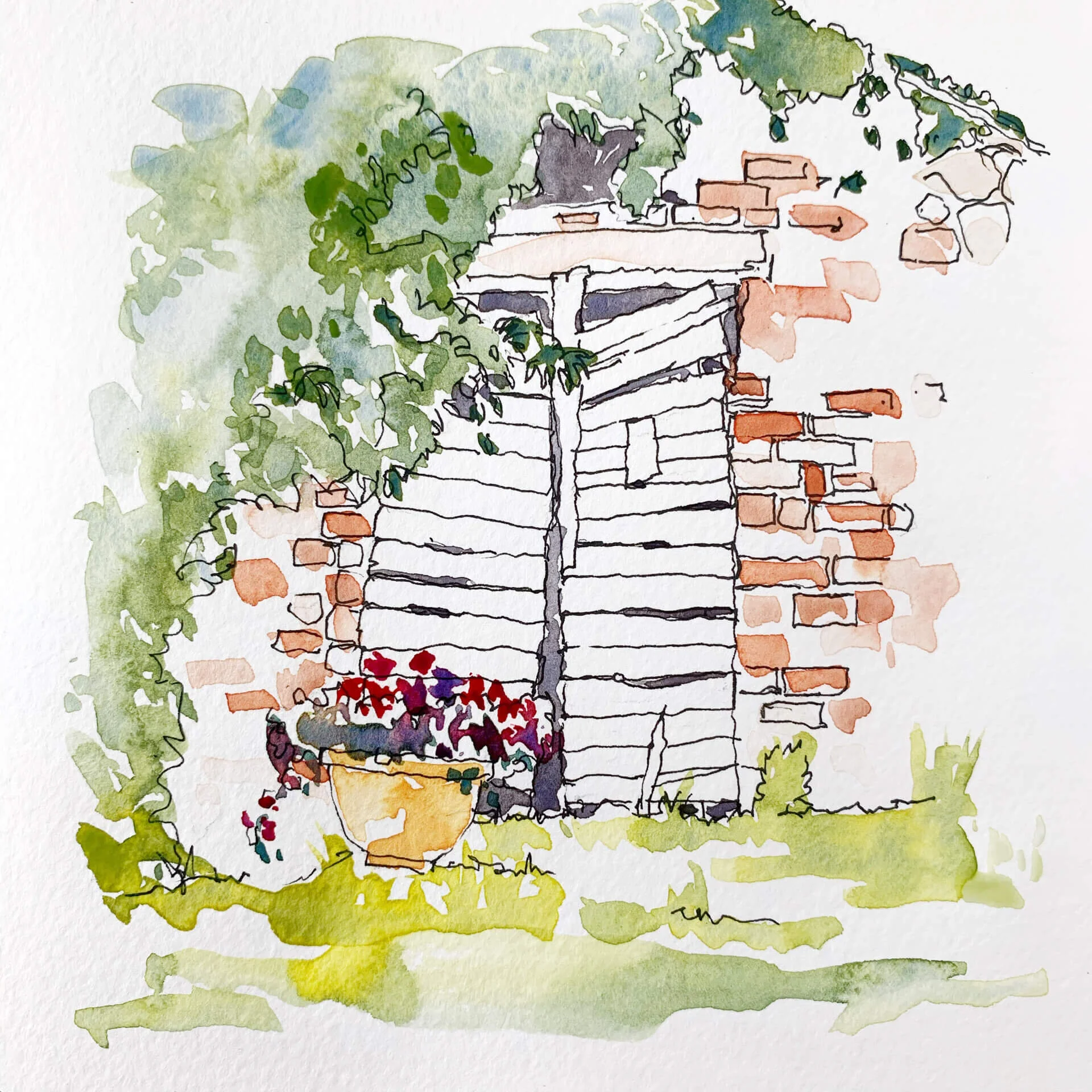
Painting with a limited palette can be fun and challenging - in a good way! It helps you exercise your creativity and actually helps remove some of the overwhelm you might feel when you have too many colors to choose from!
I hope this post was helpful - let me know in the comments if it was! Or if you have your own top picks, share them below!
As always, thank you for reading,
Susan
Looking for more guidance with picking a basic color palette? Check out my FREE 12-Color Palette Guide here where I share my own color selections.

Get a convenient list of my 12-color palette colors
Grab link to the exact paints I’m using + an alternate option/example
Use it as a guide to build your own palette
