
Gradient Watercolor Background Experiments
Hake brushes have been on my mind lately. I’m *this* close to buying one, it’s in my shopping cart on dickblick.com and I just haven’t let myself purchase it yet. If you don’t know what a hake brush is, they are large wash brushes that hold lots of water. In my dreams, I want to use it to prep a big sheet of paper with water so I can paint soft blue watercolor skies with fluffy clouds.
Until that happens I decided I should experiment with some gradient washes because it’s not something that I normally paint. These gradient washes make really nice backgrounds to letter on top of or can be scanned and used as backgrounds for digital designs too.
As with anything that I’m not used to doing, I knew it was going to take at least a few tries before I ended up with something I would be happy with. Instead of haphazardly testing these on random paper, I did the experiments in a (sort-of) systematic way so that I could share the results. I’ll walk through each one along with some thoughts and lessons-learned that led me to the final version.
Supplies for Experiments
Paper: I wanted to test the results on what I call “good” vs “great” coldpress paper
Good Coldpress Paper: Canson XL Watercolor Paper
Great Coldpress Paper: Assorted - see each experiment for specific paper used
All experiments are done on 6"x9" size paper
Paints: Daniel Smith (exact colors provided below!)
Brushes:
Grumbacher Goldenedge 3/4” Aquarelle (Flat)
Grumbacher Goldenedge Size 12 Round
A note on good vs. great paper
As I mentioned in the supplies, I was really curious the results I would get for gradient backgrounds when using different paper. I think that the type of paper used for watercolors makes all the difference in how “successful” we feel with the results - more so than brushes and paints!
With that being said, I classify Canson XL Watercolor Paper as a “good” paper. It’s very well priced, holds water well, and colors stay bright on it. But when it dries, there tend to be more hard edges with a look that I would call more “illustrated”. While there is nothing wrong with that at all (in fact I love it for painting handmade cards). I think this is due to the fact that it has a smoother surface and I like the softer look more organic look I’m able to get on the papers that have more prominent cold press texture.
I actually plan to do a future post comparing different papers across different brands because I have collected quite a few samples. Is it weird to say I am excited about doing paper tests?
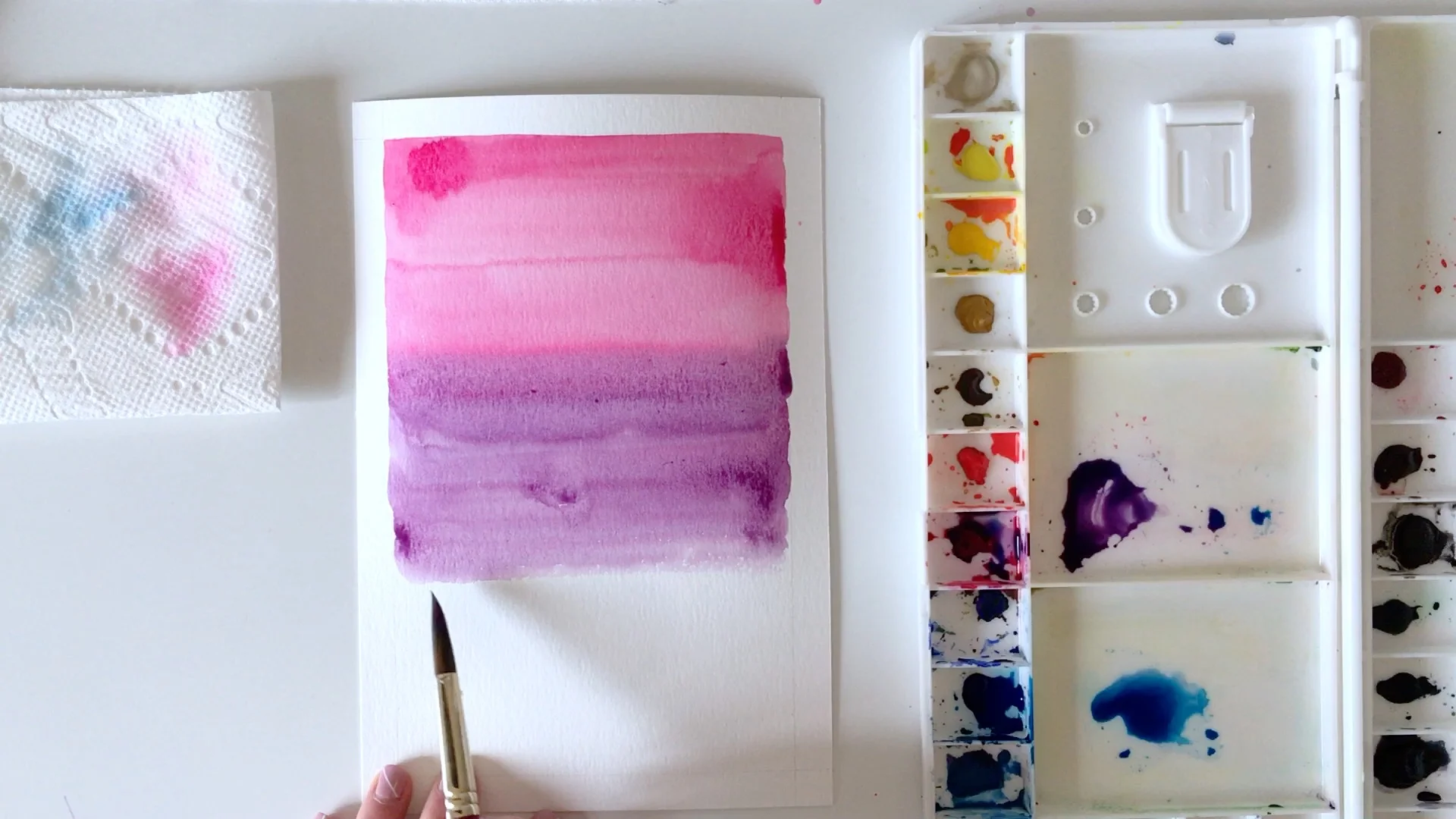
Anyways, let's get on with the experiments. Oh, and feel free to scroll on to the bottom if you would rather watch this process on video. If it's interesting you may want to come back here for my thoughts and insights that I only noted here in the blog post!

Experiment #1:
Paints: Daniel Smith Quinacridone Rose & French Ultramarine
Good Paper: Canson XL Watercolor Paper
Prep: Taped edges
Technique: Wet-in-wet
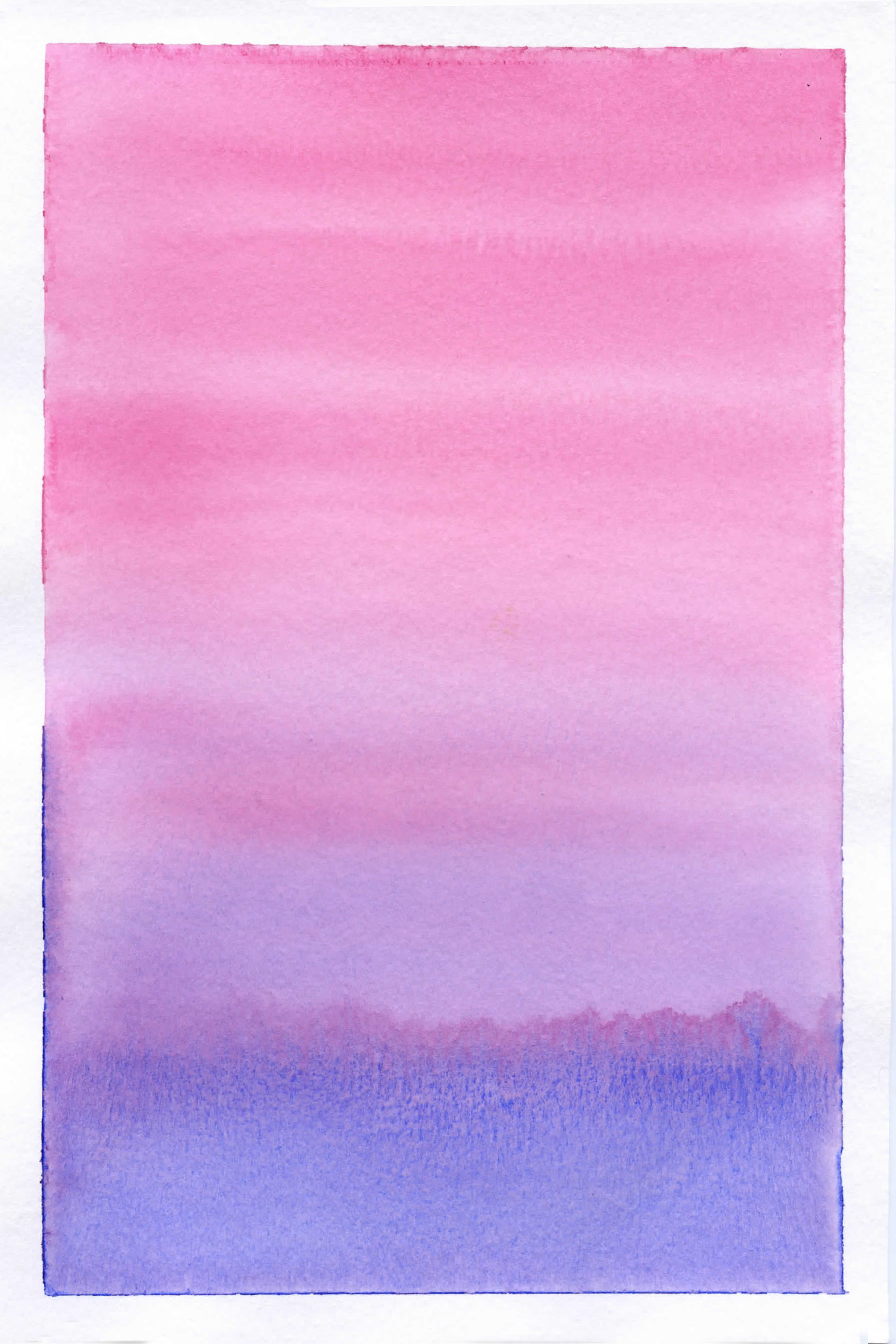
Experiment #1 Thoughts:
Taped the edges because I’m going to be loading this paper with a lot of water and I wasn’t sure how it would handle it. In the end, I prefer the look of clean edges for these studies
The flat brush was nice to use for both pre-wetting and for applying color even though it was a little to big for the wells. Also not a brush I use often so it was fun to put it to work.
That last swatch of color at the bottom came out too blue and was too watery - as evidenced from the back run.
Dried “stripier” than I would have liked, but the softness of the upper part isn’t too bad
Experiment #2:
Paints: Daniel Smith Quinacridone Rose & Phthalo Blue (Green Shade)
Good Paper: Canson XL Watercolor Paper
Prep: Drawn Border, no tape
Technique: Wet-on-Dry (pretty juicy brush)

Experiment #2 Thoughts:
Unfinished edges like this bother me!
I really don’t like how stripe-y this is, especially with all the hard edges around the brush strokes
I think that the Canson paper is more prone to this effect especially when using a lot of water. Except, to be fair I might have also been using more water than necessary
Made quite a few splotches in the middle areas and just let it dry like that. Should have tried to fix those!

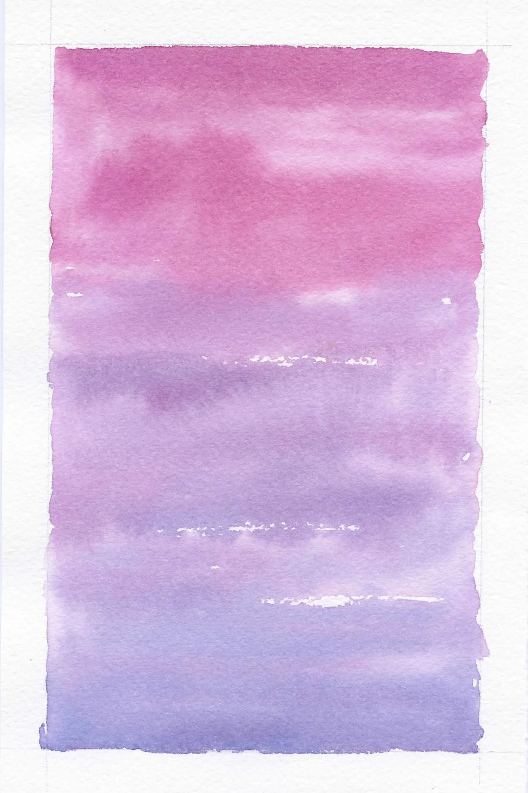
Experiment #3:
Great Paper: Legion Stonehenge Aqua Coldpress
Prep: Drawn Border, no tape
Paints: Daniel Smith Quinacridone Rose & Phthalo Blue
Technique: Wet-on-Dry (drier brush)

Experiment #3 Thoughts:
Still don’t like the unfinished edges
I tried a drier brush because I like seeing the texture of the paper
Purposely left white areas, just to experiment
Took down the saturation/Intensity of the color
For wet-on-dry applications there isn’t as much of a need to tape down the edges, paper warps but dries flat

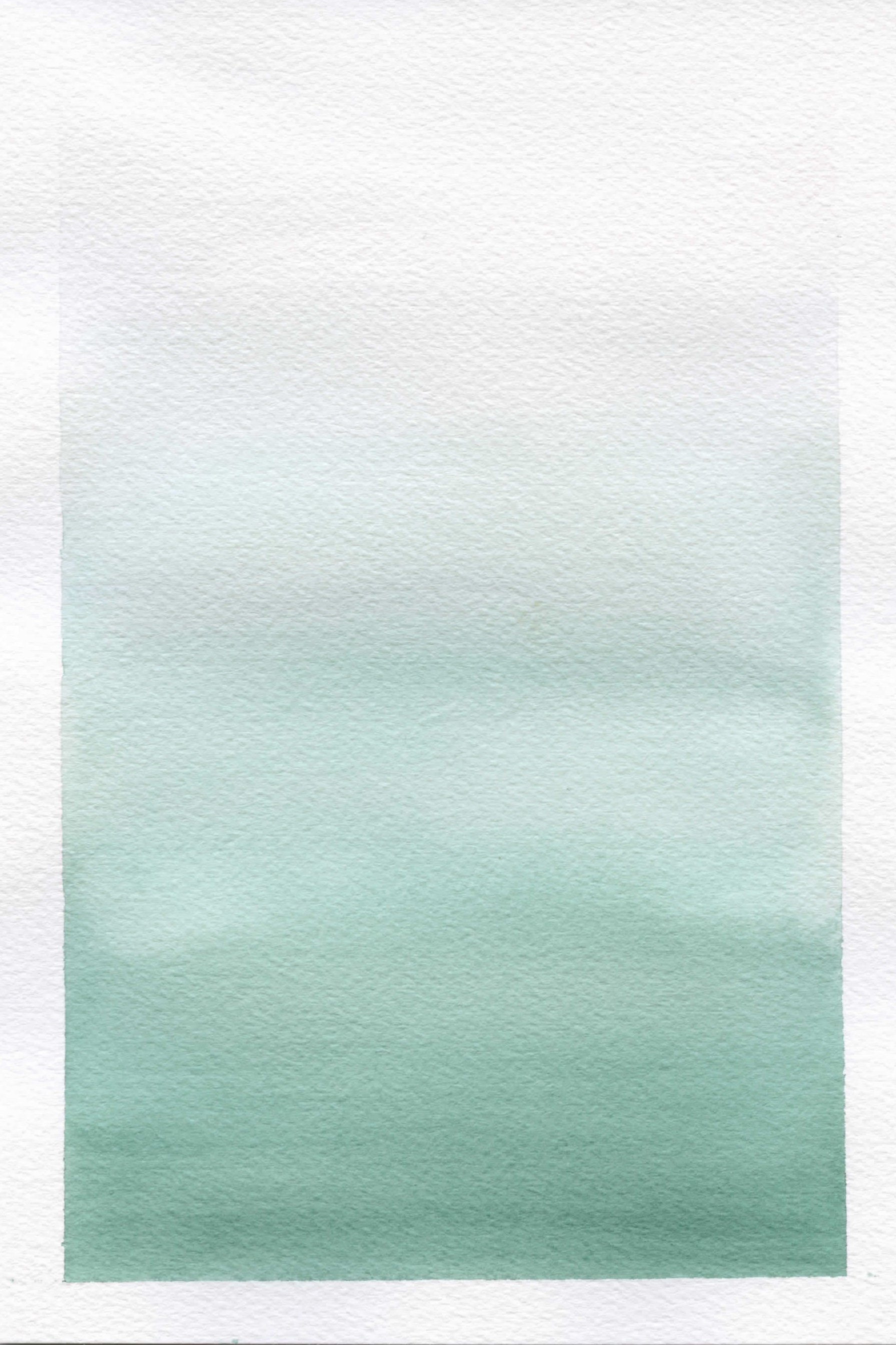
Experiment #4:
Great Paper: Arches 140 lb Coldpress
Prep: Drawn Border, no tape
Paints: Daniel Smith Quinacridone Rose & Phthalo Blue (Green Shade)
Technique: top half Wet-in-Wet/ bottom half Wet-on-Dry
Experiment #4 Thoughts:
Tried wet-in-wet technique with lighter colors and a round brush
Experimented with an uneven wash
Prefer the even gradient wash from previous experiments
Love the atmospheric effect though
Arches paper dries with soft blending which I love

Final Version:
Combining the elements that I thought worked well the 4 experiments:
Great Paper: Arches 140lb Coldpress
Prep: Taped Edges
Paints: Daniel Smith Pyrrol Scarlet & Phthalo Green (Blue Shade)
Brushes:
Grumbacher Goldenedge 3/4” Aquarelle - to pre-wet and smooth out color
Grumbacher Goldenedge Size 12 Round - to apply color
Technique Wet-in-Wet for a softer look
In addition to the above decision, I also attempted a single color gradient so I could focus less on color transition and more on eliminating the banding that I wasn’t liking. Plus, I’ve always been more of a fan of the single color transitions.
I used a soft green that I actually picked from the large color mixing chart that I painted in this blog post. A good example of how the charts can be really useful!
Final Version Thoughts:
Paper buckled while wet as expected but dried pretty flat - you can definitely still see the buckle in the paper when I scanned it thought!
I did have to go back in with the moist flat brush to even out the color for finishing touches and keep it as smooth as possible
I'm happiest with the results of this version so I think the experimentation paid off.
If you didn’t already expect it, I love the more minimal look with the one color gradient. I like that it doesn’t compete with any lettering or graphics that would go over it because of the smoother transitions.
As I mentioned above, I thought it would be fun to try and film this process, edit it, and put it up on YouTube to share. I don't know if it's helpful (and I'm also not the greatest video editor), but if it is, I would love if you let me know. That way, I know I should keep going and try to get better at these!
If this was helpful, let me know in the comments (or over on youtube) and if there's anything else you might want to see - feel free to let me know!
Thanks for reading (and watching),
Susan
*Disclosure: Some links contained in this post are affiliate links, which means that if you click on one of the product links, I’ll receive a small commission. Your cost remains the same - thank you for the support!
