
2 Ways To Watercolor Blue Skies and One Important Lesson
Every time I’ve sat down to paint a landscape, the very first thing I tackle is the sky. After all, the sky and clouds are an important backdrop to the scene.
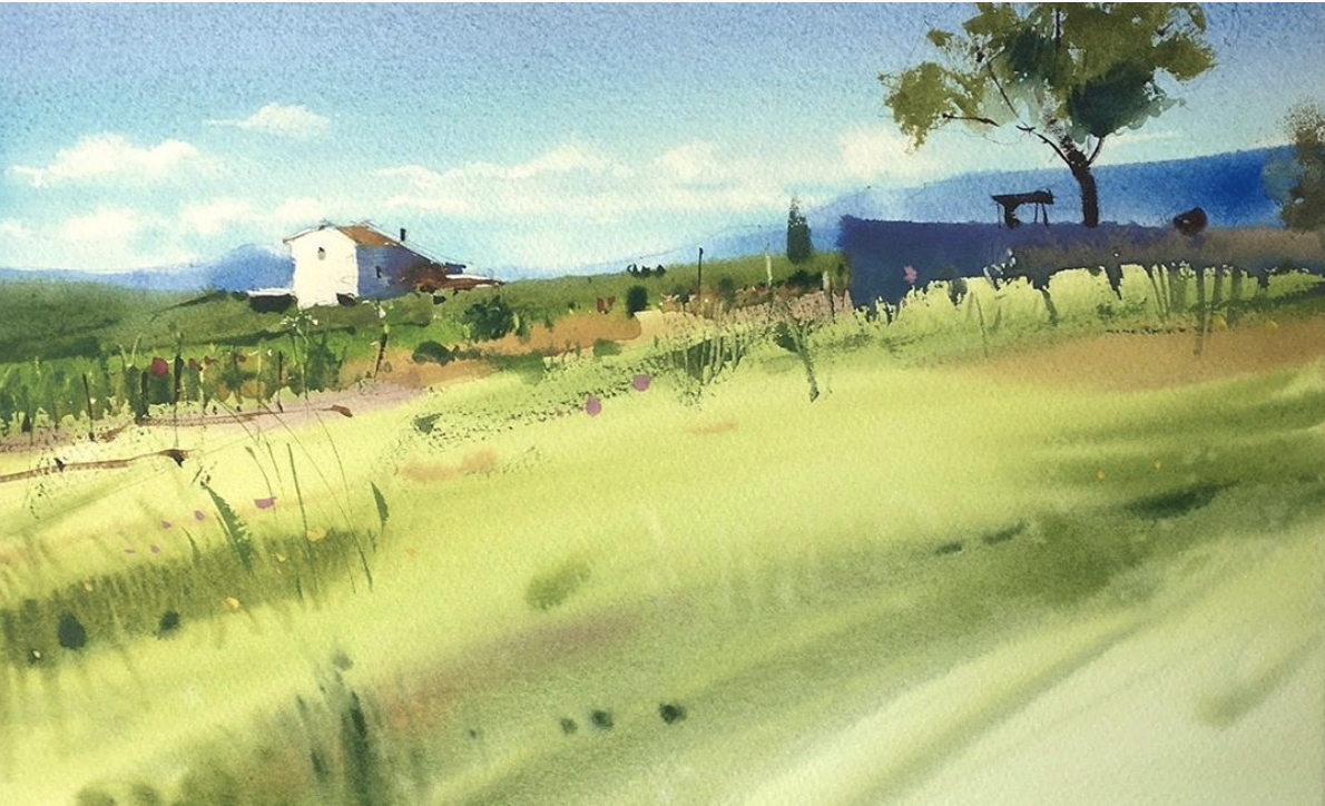
If you look closely at watercolor landscapes, many times the clouds are no more than colors blending and bleeding with just enough detail for our brains to process that what we are seeing is a sky.
If you were to isolate just the sky in these paintings, one could argue you might not even really recognize it as a sky. My point is that these clouds aren’t very realistic! So it’s not like every fluff and shadow has been captured. It’s the essence that’s been captured.
If you’re having trouble visualizing what I mean, observe the skies in the following paintings (these amazing artists are credited below each image so you can find and follow them on Instagram):

Blanca Alvarez
@blancaalvarezwatercolors
Sergei Kurbatov
@sergei.kurbatov

Architect_Watercolor
@architect_watercolor
I set out to practice different ways to capture and paint skies so that the next time I’m painting one, I’ll be more comfortable with different ways to approach them.
Capturing the essence and simplifying what we see in life or from a photo isn’t that easy. At least for me, my brain wants to translate exactly what I’m seeing directly onto the page, so I tend to get into my head about the details.
In this series of blog posts, I’m sharing my own journey in studying skies. In this first post, I’m sharing two blue skies with clouds and my lessons-learned while practicing them.
As a note before I share my studies, I concluded that if I were to paint a landscape with a sky in the background, the sky could be quite abstract - just capturing colors, shapes and movement in a very simple way.
However, if the sky was isolated as the main subject, or if the sky was a big part of the painting, I would probably put in a little more detail. Since I was isolating the sky in my studies, some of them have a more “realistic” feel than I would probably do in a landscape. But even so, the act of practicing these skies gives me a feel for how to approach and adjust them when painting for a landscape in the future.
SUPPLIES
You’ll probably be curious what supplies I used for these two examples so here they are (affiliate links)
A NOTE ABOUT COLORS
As you know, skies come in many colors. I chose to start with a single color sky because
Using multiple colors complicates the painting process. Using one color lets me concentrate on technique and approach while not fussing with mixing/blending and everything else that comes with it.
Just trying to avoid decision fatigue, you know what I mean?
From what I’ve seen, it seems the most common blues (to name a few) for sunny blue skies are:
Ultramarine
Cerulean
Cobalt
When picking your blues, take note of granulating pigments. This will vary based on the color and manufacturer so the best way is to test it out yourself on a piece of paper.
You can also look up paint characteristics from the manufacturer’s websites - most of the time they will tell you, however sometimes they don’t.
Here are the Mijello Mission Gold watercolor paint characteristics. Scroll down the page to see all the color characteristics, notice they DON’T tell you if the colors are granulating or not.
Here are Daniel Smith’s watercolor paint characteristics - they DO tell you if the color is granulating or not.
In any case, the best way is to test it on a scrap piece of paper and see for yourself, or just start painting and see what happens! (Tip: Ultramarines seem to pretty much always be granulating)
I just wanted to point it out that during these sky studies, I discovered I prefer using non-granulating blues for my skies. Although some people say granulating pigments for stormy skies is great!
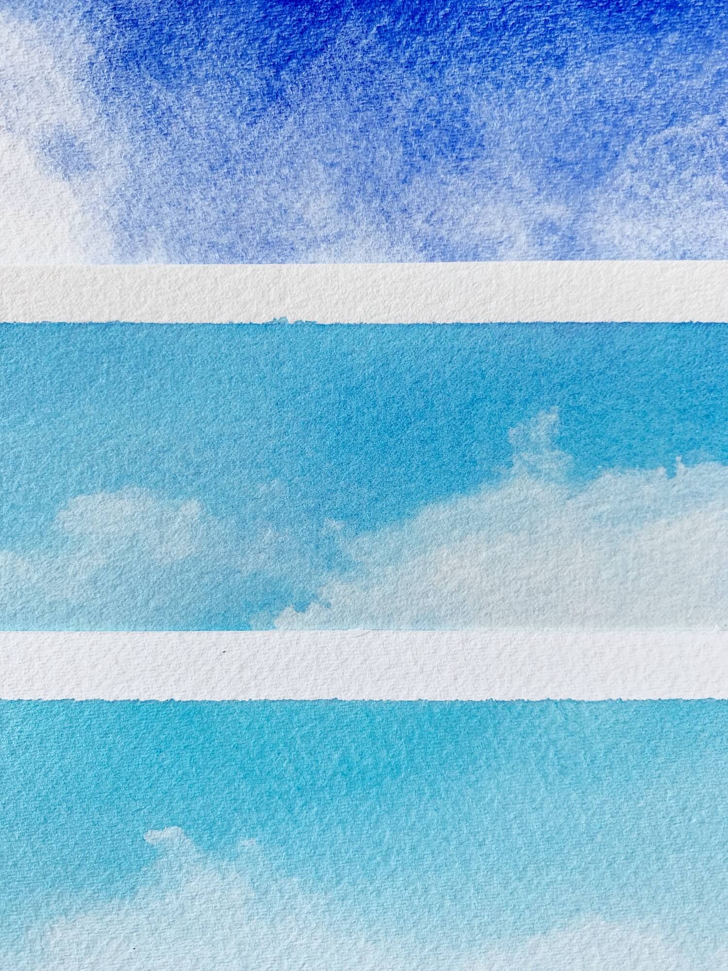
BLUE SKY #1
I started with the way I am most familiar with painting skies. This is the way I teach how to paint skies to students because it uses a basic watercolor technique, wet-on-wet. I also opted to use Ultramarine, a staple in pretty much almost any palette.
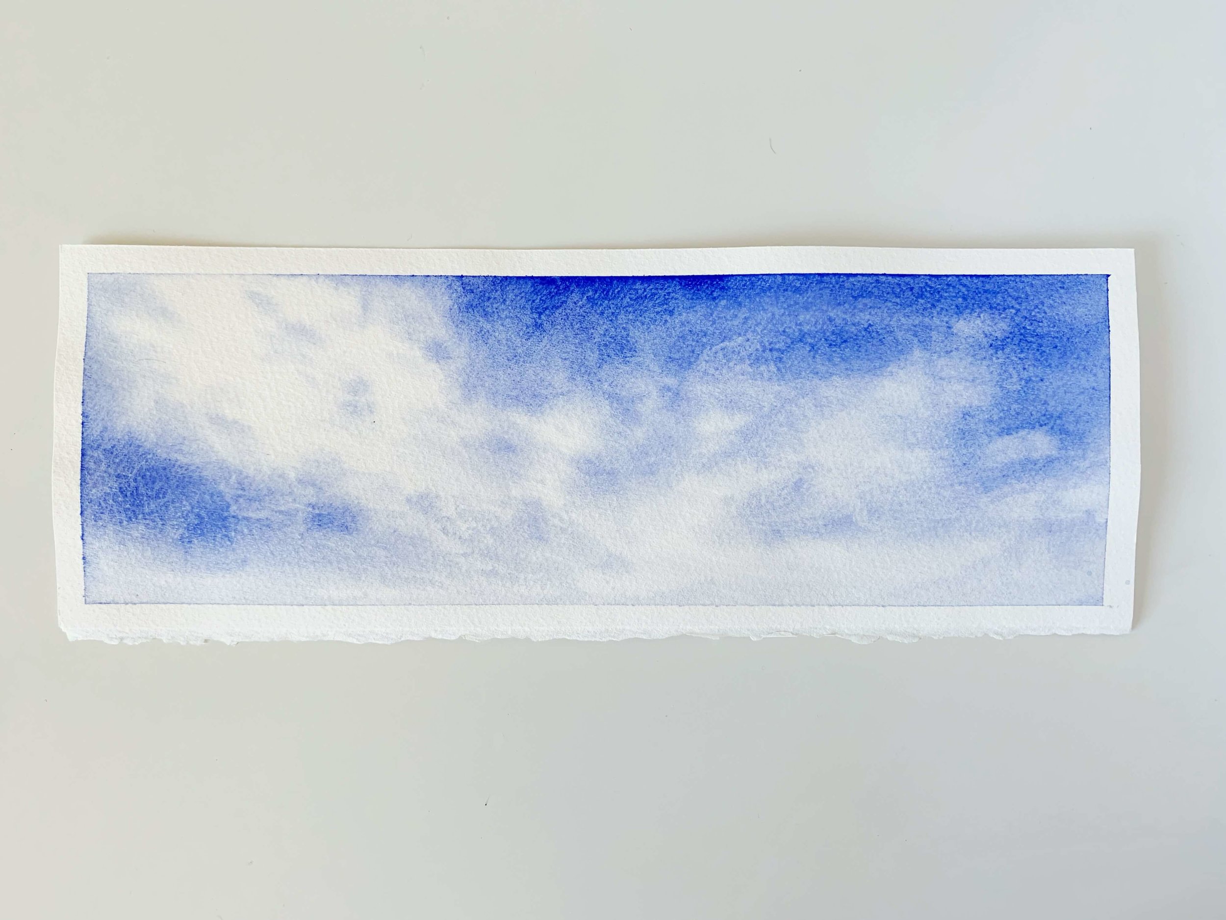
Basic steps:
Wet paper evenly - you want a dull even sheen, not pools of water.
Drop in color while leaving the whites of the paper for cloud areas.
Soften edges of white areas and dot in more sky areas using light pigment and a dry/damp (not wet) brush.
Lift up paint to create more clouds by blotting with a dry brush or some paper towel.


Lessons learned:
Granulating paints create interesting skies but I personally don’t like the grainy look for a clear blue sky
Leaving the white areas of the clouds (painting around them) can be a bit tricky unless perhaps I pencil in the cloud formations first next time
It could have done less “touching up” and I need to watch out for overworking
BLUE SKY #2
After the first one, I practiced a few more attempts that weren’t great until I had a bit of a breakthrough and ended up with this attempt. I realized that the key to sky with movement was a combination of the way I moved the brush on the paper when applying color and then leaving it alone.
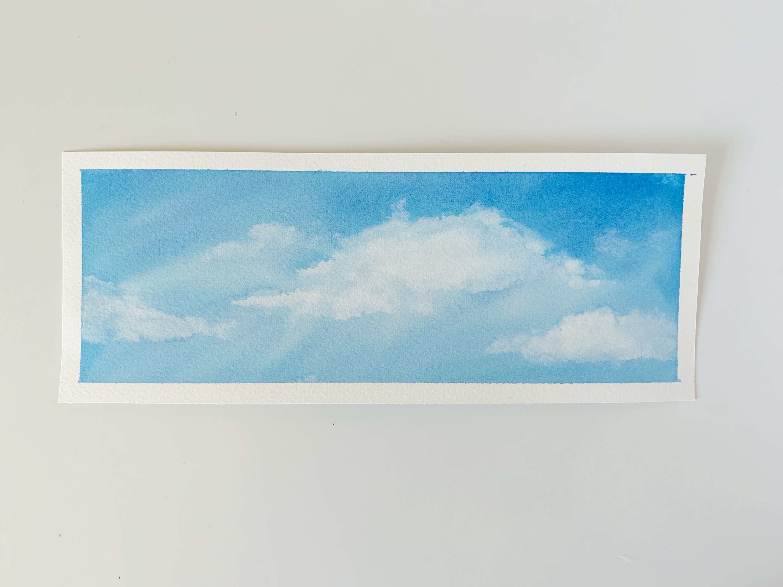
Basic Steps:
Wet paper evenly
Drop in color all over (more concentrated color at the top, lighter at the bottom) using a round brush loaded with color - not the flat brush
Lift up paint to create more clouds (blotting it up with a dry brush or some paper)
Soften edges using a damp (not wet brush)


Lessons Learned:
Less is more - when dropping in color, use fluid, organic strokes - it doesn’t have to be perfect. And then stop touching it!
When lifting with paper towel, make sure it’s relatively clean so you don’t put paint back down on the paper (switch it up and use clean parts of the paper towel)
When softening edges with your damp brush make sure it’s dry enough so that you’re not introducing water back into the painting and creating backruns (unless that’s what you want!)
I know all this writing may be hard to follow, but I wanted to describe the thoughts and process in written word to provide some background to the video. Now, here’s a timelapse video of both sky paintings to help with the visuals:

THE MOST IMPORTANT LESSON I learned
This is the main thing I want to remember from these exercises so I can apply it in the future - not only when painting skies, but when watercoloring in general:
The movement of the brush strokes creates movement and dimension in the painting, especially in large areas of washes. But the magic really happens when you don’t push the paint around too much on the paper. Learn to let go and leave it be.
I hope you enjoyed hearing my thoughts and process with these blue skies. I’ll be sharing some soft gradient skies with subtle clouds in the next post!
As always, thank you for reading,
Susan
Just getting started and want some help with supplies?
Download my free beginner’s supply guide by entering your information below!